Summary
Transform Your Aussie Renovations: Discover the Statement Colors Set to Shine in 2026 explores the emerging color trends shaping home renovations across Australia in the coming year. With homeowners increasingly prioritizing personal expression and comfort over resale value, Australian renovations are embracing nature-inspired palettes that blend warmth, tranquility, and subtle drama to create meaningful, restorative living environments. This shift marks a departure from the cooler greys and stark whites that have dominated recent years, signaling a renewed focus on colors that evoke calmness, connection to the outdoors, and layered texture.
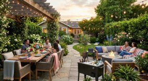
Central to 2026’s palette are statement colors such as eucalyptus greens, soft sage tones, and warm khakis, alongside moody accents like softer blacks and deep plums that add depth and sophistication to both interiors and exteriors. These hues reflect a broader lifestyle trend toward mindful living and wellness, with color choices thoughtfully aligned to enhance mood and highlight architectural features. Experts forecast that this approach will inspire Australian homeowners and designers to create spaces that balance intimate cocooning with vibrant character, employing natural materials like timber and stone to reinforce the connection to the environment.
Technological advancements in paint formulations are also playing a pivotal role in enabling these trends. Innovations such as faster-drying, dirt-repellent, and UV-protective coatings ensure that statement colors maintain their vibrancy and durability despite Australia’s diverse climate challenges. These improvements, combined with evolving design sensibilities, provide practical solutions for achieving sophisticated and long-lasting finishes while embracing sustainability and ease of maintenance.
While the trend has been widely embraced, some caution is advised regarding the use of bold primary colors, which can overwhelm if not carefully balanced with neutral tones and textures. Nevertheless, the 2026 color forecasts and case studies demonstrate a dynamic and regionally nuanced landscape of renovation choices, reflecting Australia’s unique architectural heritage, environmental influences, and the growing desire for personalized, joyful living spaces.
Overview of Home Renovations in Australia
Home renovations in Australia are increasingly influenced by a desire for personalized and meaningful living spaces, as homeowners tend to stay longer in their existing homes due to economic factors such as high interest rates. This shift has led to a reduced focus on resale value, with more emphasis placed on incorporating color, warmth, and personality into renovations to create spaces that bring joy and comfort to their occupants.
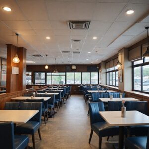
When it comes to house painting, staying current with evolving trends is essential for enhancing a home’s aesthetic appeal. In Australia, the selection of home colours is closely tied to the architectural style of the property—heritage homes typically favour muted, subdued tones, while modern constructions can accommodate bolder, more dynamic shades. A popular approach is balancing warm wall colours with cool trims to achieve visual harmony.
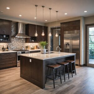
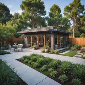
Exterior colour trends emphasize a connection to the natural environment, with warm beiges, soft greys, and creamy whites forming a timeless palette that suits both urban and rural settings. These colours pair well with natural materials such as timber and stone, further reinforcing the Australian lifestyle’s affinity for nature. Notable paint ranges like Dulux’s Terrain and Taubmans’ Stonehenge have emerged as favourites in this category. Additionally, earthy greens—sage, olive, and eucalyptus tones—are gaining popularity as part of the broader home colour trend across the country.
The evolving tastes in interior design are also reflected in predictions by experts and annual colour forecasts such as the Dulux Colour Forecast, which guides architects, designers, and renovators in selecting tonal palettes for upcoming years. The 2026 forecast indicates notable shifts in preferred interior tones, encouraging homeowners to embrace fresh and surprising colour choices that resonate with modern sensibilities and lifestyle needs.
Importance of Color in Home Renovations
Color plays a pivotal role in home renovations, serving not only as a design element but also as a powerful medium to express mood, personality, and intention within interior spaces. As homeowners increasingly prioritize personal happiness over resale value, renovations are reflecting more warmth, color, and individual character, moving away from generic, universally appealing designs toward spaces that feel authentic and inviting.
The psychological impact of color is significant, influencing how occupants feel and perceive their surroundings. Color psychology studies how different hues can evoke emotions and reactions, shaping the overall experience of a home. This understanding is particularly important when planning renovations, as color choices can enhance comfort, calm, and even stimulate creativity or relaxation.
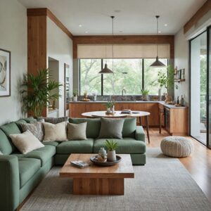
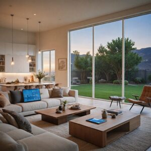
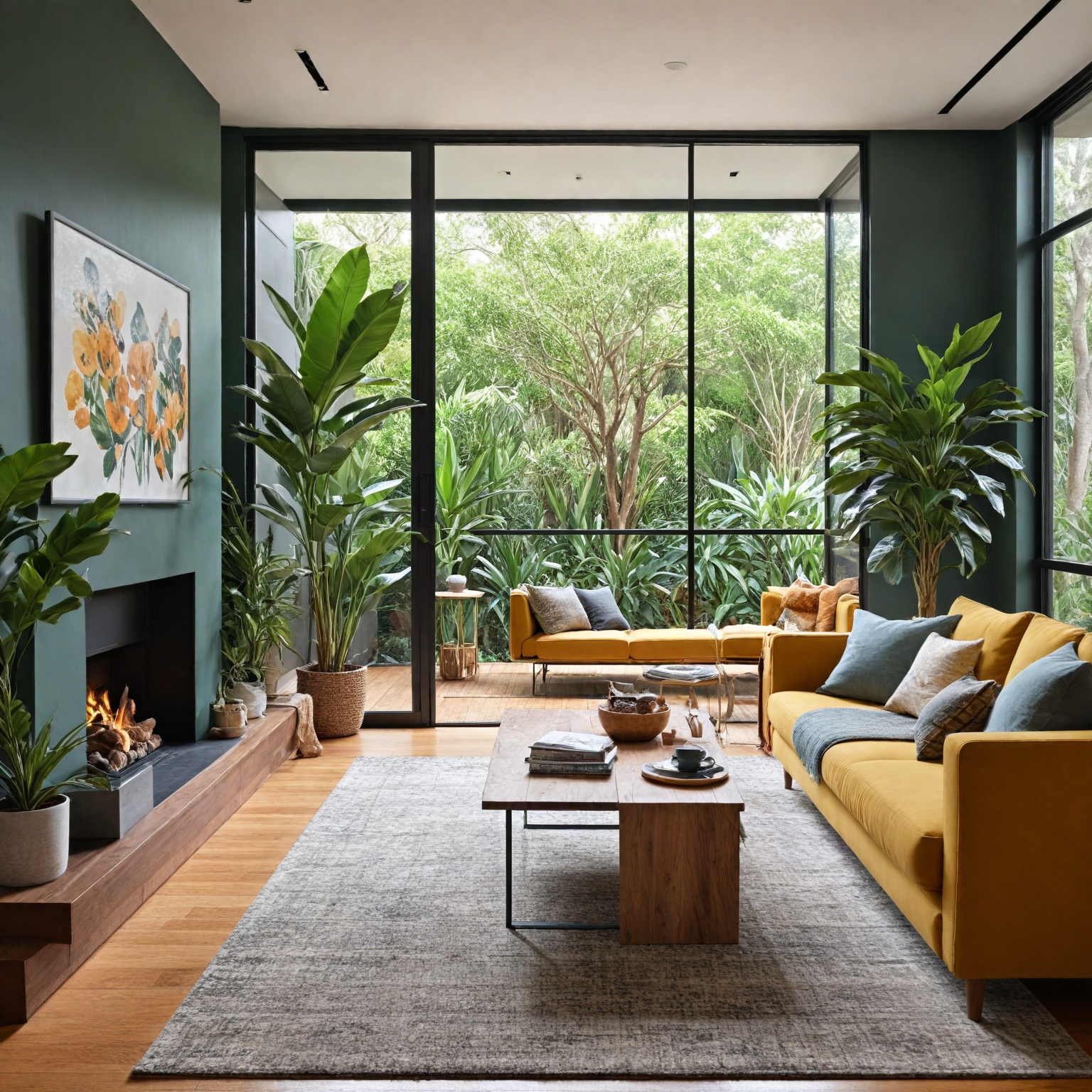
In 2026, the trend leans toward harmony between soft warmth and quiet drama, with natural tones being elevated and bold accents reintroduced confidently. Interiors will favor palettes grounded in nature and layered with texture, such as clay, sand, olive tones, and warm tans. These colors invite both calm and character, creating spaces that feel tactile and welcoming. For example, moody shades like softer blacks serve as dramatic yet versatile foundations, pairing well with creamy whites or dusty pinks, and beautifully highlighting a variety of textures from matte ceramics to plaster walls.
Moreover, color is not confined to interiors. The exterior of homes also reflects evolving tastes, especially in Australia, where connection to nature is emphasized. Warm beiges, soft greys, and creamy whites provide timeless bases that complement natural materials like timber and stone. Greens in shades such as sage, olive, and eucalyptus are gaining popularity, reinforcing the bond between home and environment while offering a modern yet natural aesthetic.
In some cases, using color strategically reduces the need for other design elements. For instance, incorporating the right green tones inside can decrease reliance on indoor plants, adding freshness without additional upkeep. When applied thoughtfully, primary colors can accentuate architectural details like front doors and trims, although caution is advised as their boldness can be overwhelming if not balanced properly.
Ultimately, the emerging renovation trends underscore the value of color as a medium for personal and cultural expression, allowing homeowners to embed their feelings and traditions into their living spaces through thoughtful color and texture choices.
Statement Colors Predicted for 2026
The color trends for 2026 emphasize rich, soothing, and nature-inspired hues that bring a sense of calm and confidence to home interiors. A notable trend is the increased use of eucalyptus tones, khakis, and soft shades of sage, which are expected to make a strong return in the coming year. These colors reflect a growing desire for restorative and mindful living, where home environments foster tranquility and connection to nature.
Among the standout colors is Behr’s “Hidden Gem,” a hue combining blues and greens to create a statement that is both bold and subtle, aligning with the preference for colors that make an impact without overwhelming the space. Similarly, Warm Eucalyptus, described as naturally restorative and serene, has been highlighted as a key color of the year, embodying the trend toward slowing down and appreciating small moments through design.
Sage green, in its soft, peaceful tone, is another popular choice for adding a calming atmosphere to interiors. It is favored for its versatility and gentle presence, being less assertive than blue but equally effective in setting a tranquil mood. This green hue pairs well with natural materials such as warm timber and brass or bronze fixtures, further enhancing a grounded, sophisticated look connected to the outdoors.
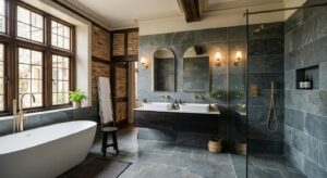
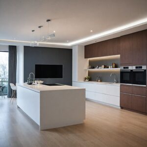
Dark, moody palettes also continue to gain popularity, with black serving as a dramatic yet forgiving foundation. When paired with eucalyptus green, black helps create interiors that are both sleek and cocooning, perfect for kitchens, bedrooms, or living rooms. This combination allows for rich textural contrasts, highlighting elements like plaster walls, matte ceramics, and soft fabrics.
Characteristics and Mood Effects of Popular Statement Colors
As interior design trends evolve into 2026, statement colors play a significant role in shaping the mood and personality of Australian homes. These hues are not only visually striking but also evoke particular emotional responses that enhance the atmosphere of living spaces.
Eucalyptus tones, alongside khakis and soft shades of sage, are set to make a notable comeback. These greens, inspired by natural elements, bring a sense of calmness and connection to the outdoors. They are particularly effective in creating serene environments, making them ideal for carpets, rugs, and accent pieces that promote relaxation and grounding within a room.
In contrast, darker palettes incorporating black paired with eucalyptus green introduce a dramatic and moody ambiance. This combination adds depth and sophistication, suitable for those seeking a bolder, more intimate setting. The balance between soft natural hues and deeper shades allows homeowners to express both warmth and quiet drama simultaneously.
Terracotta tones, drawing inspiration from the Australian outback, contribute warmth and rustic refinement, especially when used on exterior surfaces. When combined with neutral roofs and lush greenery, these hues evoke a welcoming and earthy vibe. Inside the home, such warm colors help replace colder greys with inviting warm whites, oatmeals, and greiges, fostering spaces that feel both tranquil and dynamic.
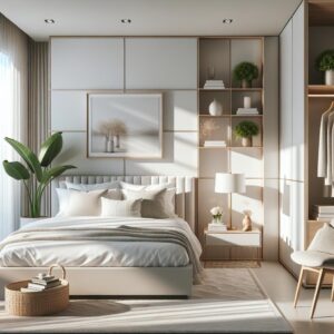
Soft grays, beiges, and warm whites often serve as foundational colors, creating versatile backdrops that enable more vibrant statement colors to shine. This layering of tones supports personal expression through color and texture, emphasizing harmony and individuality in design choices.
Application of Statement Colors in Australian Renovations
In 2026, Australian home renovations are embracing statement colors that bring warmth, depth, and personality to both interiors and exteriors. This trend moves away from the cooler greys and stark whites that dominated previous years, favoring richer, earth-inspired hues and natural textures that invite comfort and sophistication.
Exterior Color Schemes
A popular approach to exterior renovations involves the use of two-tone color schemes, which highlight architectural features such as trims and gable decorations. For example, pairing classic whites with soft greys or muted eucalyptus greens creates a fresh yet timeless look that emphasizes texture and detail. Colorbond Steel hues like Surfmist, Deep Ocean, Dune, and Pale Eucalyptus are commonly used to achieve this effect, offering both contrast and harmony with the surrounding environment.
Warm terracotta tones inspired by the Australian outback are also gaining popularity for exteriors, providing a rustic but refined aesthetic when combined with neutral roofs and lush greenery. These shades complement natural building materials while adding inviting warmth to façades.
Interior Color Applications
Inside Australian homes, statement colors are being used to create spaces that balance intimacy with vibrancy. Deep, grounded reds such as Sherwin-Williams’ Carriage Door and Aurora Brown add sophistication and drama to “jewel box” rooms like pantries, bars, or lounges, where a cozy, atmospheric feel is desired. Meanwhile, rich hues like Velvet Plum evoke the luxury of velvet textiles and autumnal richness, fitting perfectly with the trend toward moody, textured interiors in 2026.
Green tones remain popular but have shifted toward deeper, earthier shades, replacing lighter sage greens. These colors bring a sense of restoration and connection to nature, especially when paired with wood or woven textures. Incorporating houseplants further enhances this natural theme, with real foliage recommended for its texture and vitality.
Soft whites and creams continue to serve as a foundation for layering texture and color, preventing spaces from feeling sterile while enhancing lightness and airiness in smaller or dimmer rooms. Meanwhile, cool blues in tones ranging from dusty teal to navy-grey help regulate mood and promote calmness, particularly in warmer climates or brightly lit interiors.
Material-Specific Paint Considerations
Selecting the right paint for different exterior surfaces is crucial for both aesthetic and functional reasons. Brick walls, for instance, require breathable paints to allow moisture to escape, with sealing or priming recommended to improve adhesion and longevity. Rendered walls benefit from flexible, crack-bridging paints that accommodate surface movement without compromising finish quality. Attention to these details ensures that statement colors not only look striking but also withstand Australia’s varied climate conditions.
Maintaining Natural Wood Tones
For eucalyptus wood features and furniture, preserving the warm, rich tones requires gentle maintenance. Light sanding to remove surface fuzziness followed by application of eucalyptus-specific oil treatments helps restore and maintain the natural beauty of the wood, supporting the overall warmth and authenticity of Australian renovations embracing natural color palettes.
Surface Preparation and Painting Techniques for Statement Colors
Proper surface preparation is essential to achieve the true vibrancy of statement colors and to ensure long-lasting results. Many paints reveal their authentic hues and require fewer coats when applied over an appropriate primer. Priming not only enhances color depth but also helps to cover existing paint colors and surface blemishes, particularly on porous materials such as drywall, masonry, and wood, which can otherwise absorb paint unevenly.
Before painting, it is important to clean walls thoroughly. If the surface is clean and in good condition, the need for primer may be reduced, but cleaning remains crucial. This can be done using tri-sodium phosphate (TSP) and water or, alternatively, dry cleaning with a brush attachment on a shop vacuum to remove dust, cobwebs, and debris. For optimal primer application, maintain a consistent spraying distance and angle, avoid pivoting movements, and begin moving the spray system before triggering paint release to prevent excess buildup in one area. Advanced spray systems, such as those from WAGNER, facilitate efficient and even application and are designed for easy cleaning post-use.
Innovations in primer and paint technologies also contribute to better protection and longevity. Products like ColorShield™ create flexible and breathable barriers that fuse paint layers while incorporating UV absorbers to protect against fading, cracking, and chalking caused by sunlight exposure. Selecting the right primer and paint tailored to the surface material is critical, especially for exterior surfaces exposed to harsh Australian climates. For instance, brick surfaces require breathable paints that allow moisture escape and should always be sealed or primed before painting to ensure proper adhesion and prevent moisture absorption.
When it comes to the actual painting process, layering different tones of white—such as warmer whites for walls paired with cooler or brighter whites for trims or fascias—can enhance visual depth and create timeless elegance. Moreover, modern paints boast faster drying times and increased coverage efficiency. For example, Benjamin Moore’s Coronado® Super Kote 5000® Interior Paint and Behr’s Premium Plus line offer drying times as quick as one hour, allowing for faster recoating and shorter project durations. These advancements, alongside improved formulations that repel dirt and grime by up to 20% more than earlier products, help maintain the aesthetic appeal of painted surfaces longer.
By combining meticulous surface preparation, appropriate primer selection, and utilization of cutting-edge painting technologies, homeowners can ensure that their statement colors stand out vividly and endure the test of time in any renovation project.
Technological Advancements in Paint Formulations
Recent advancements in paint technology have significantly improved both the performance and sustainability of paint products, offering enhanced benefits for homeowners and professionals alike. Companies such as Behr and Jotun have pioneered formulations that repel up to 20% more dirt and grime, thereby maintaining cleaner surfaces for up to five years longer than previous generations of paint. Additionally, anti-graffiti paints developed by manufacturers like Dulux have reduced maintenance time in graffiti-prone areas by approximately 35%, making them highly effective for urban and commercial applications.
Efficiency has also increased with new paints offering about 20% more coverage per liter compared to standard products from 2020, allowing for more economical use of materials. Furthermore, drying times have improved by up to 40%, enabling faster project completion without sacrificing quality or durability. These innovations are designed to address everyday challenges such as resisting scuffs, repelling spills, and ensuring quicker turnaround times for painting jobs, reflecting the evolving preferences of homeowners and designers.
Another significant technological breakthrough is the development of advanced protective coatings like ColorShield™ UV Paint Preserver, which safeguards murals and decorative surfaces from fading and deterioration caused by ultraviolet (UV) light, corrosion, and water damage. This flexible and breathable barrier not only prevents common issues such as cracking and chalking but also helps fuse paint layers for long-term preservation. European research highlights the importance of combining UV absorbers (UVAs) with hindered amine light stabilizers (HALS) and lignin stabilizing pretreatments in clear coatings to retain both the aesthetic and mechanical properties of painted wood surfaces. Although the optimal formulation ratios are still under study, ongoing research
Practical Tips for Incorporating Statement Colors
When integrating statement colors into your home renovation, a thoughtful approach can enhance both the aesthetic appeal and functionality of your space. One effective method is to use a suitable primer that allows paints to achieve their true color with fewer coats, ensuring vibrant and lasting results. For exteriors, incorporating pops of primary colors can accentuate architectural details such as front doors, trims, and letterboxes, creating playful yet controlled visual interest. However, caution is advised since primary colors can be overwhelming if not balanced properly.
Choosing the right color palette is essential. Neutral tones like beige, soft grey, and warm whites are a fool-proof choice for exteriors, pairing harmoniously with natural materials such as stone and timber or modern finishes like metal cladding and concrete render. Layering white tones—using warmer whites on walls and cooler or brighter shades for trims and fascias—adds depth and prevents a flat appearance. For a warm and rustic look inspired by the Australian outback, terracotta hues paired with neutral roofs and lush greenery provide a refined yet inviting facade.
Interiors benefit from dramatic yet versatile shades like muted dark tones that offer a cocooning effect in bedrooms and living rooms or a sleek architectural look in kitchens. These colors pair well with creamy whites, dusty pinks, warm tans, or tonal greys and moody blues, creating a gallery-style aesthetic that highlights textures ranging from plaster walls to soft fabrics. Embracing nature-inspired, restorative colors can also blur indoor and outdoor boundaries, especially when combined with organic materials such as ceramics, wood, and bio-based finishes. Incorporating colors like subtle blues warmed by green undertones or cozy deep browns with gray undertones fosters a calming atmosphere that bridges the natural world.
When selecting colors for different architectural styles, heritage homes tend to suit muted tones, while modern builds can handle bolder shades. A balanced approach mixing warm walls with cool trims ensures harmony throughout the design. Consulting local professionals can provide valuable insights into regional trends and practical challenges, helping you achieve a cohesive and stylish look. By applying these practical tips, you can confidently incorporate statement colors that make a lasting impression while reflecting your personal style and the unique Australian environment.
Case Studies and Examples
In 2026, Australian home renovations are increasingly embracing statement colors that balance both aesthetic appeal and regional suitability. For instance, warmer climates favor pale hybrid hues and sheer curtains that maximize natural light and airflow, enhancing comfort while complementing local weather conditions. Conversely, cooler regions see a resurgence of heritage-inspired parquetry and layered window treatments, creating cozy, tactile interiors that reflect traditional sensibilities.
Exterior color schemes across different architectural styles demonstrate a clear preference for neutral palettes. From traditional cottages to contemporary luxury homes, shades such as beige, soft grey, and warm whites are chosen to harmonize with natural materials like stone and timber, as well as modern finishes including metal cladding and concrete render. This approach ensures a timeless yet modern curb appeal that resonates with Australia’s diverse environments.
Interior spaces in Australian homes are evolving toward softer lighting and warmer tones. Renowned interior designer Georgina Redenbach notes a shift away from cool greys and stark whites toward earthy clay, sand, and olive hues paired with matte and natural surface finishes. These choices create inviting environments that encourage tactile interaction and reflect multicultural influences within Australian communities.
The adoption of two-tone color schemes serves as a practical and stylish method to accentuate architectural details, particularly exterior trim work. Companies like Three Birds Renovations highlight the use of classic combinations such as crisp white with soft grey to add depth and contrast, making home features visually striking. Popular complementary colors in these schemes include Colorbond Steel Surfmist, Deep Ocean, and Dune, which provide both subtlety and character.
Key paint trends for 2026 also include a strong inclination toward restorative and nature-inspired hues. Behr’s 2026 Color of the Year, Hidden Gem—a blue-green tone—exemplifies the desire for statement colors that remain understated and calming. Similarly, Sherwin-Williams’ Sage Slate represents mindful living and restorative design, encouraging homeowners to slow down and appreciate their living spaces.
Together, these examples showcase how Australian homeowners and designers are blending functionality, heritage, and contemporary trends to create spaces that are both stylish and regionally appropriate, setting the tone for renovation projects in 2026.
Future Trends and Predictions
Looking ahead to 2026, home renovation and interior design in Australia are poised to embrace a blend of wellness, color innovation, and technological advancements that reflect evolving lifestyle priorities. Wellness-oriented features such as home gyms, saunas, and meditation rooms are expected to continue gaining traction, responding to a post-pandemic desire for restorative and mindful living environments.
Color trends for the upcoming year highlight a shift toward harmony and balance in interior spaces. The Dulux Colour Forecast for 2026 emphasizes a palette where soft warmth meets quiet drama, natural tones are elevated, and bold accents confidently return. Central to this trend is Sage Slate, named the 2026 Color of the Year, which embodies a naturally restorative and serene vibe aimed at slowing down time and appreciating small moments. Similarly, Behr’s Color of the Year, Hidden Gem, underscores the growing preference for subtle yet statement-making blues and greens that resonate with the desire for calm and subtlety in living spaces.
Beyond aesthetics, innovations in paint technology are set to transform the renovation process. New formulations focus on health benefits, convenience, sustainability, and performance improvements such as scuff resistance, spill repellence, and faster drying times. These developments not only enhance the homeowner’s experience but also cater to the professional painter’s need for efficiency and superior results.
As these trends unfold, designers are also identifying certain paint colors and styles to avoid in 2026, aiming to move beyond outdated or overused choices and embrace fresher, more thoughtful palettes. Together, these predictions signal a dynamic year ahead for Australian renovations, where color, wellness, and technology converge to create spaces that are both beautiful and meaningful.
The content is provided by Sierra Knightley, Home Upgrade News