Summary
Unleash the Power of White in Home Décor with Carlene Duffy’s Expert Tips explores the enduring appeal and nuanced application of white as a dominant color in interior and exterior design. White has long held rich cultural and historical symbolism, representing purity, peace, and transcendence across various civilizations, from ancient Egypt to modern architectural landmarks like the Taj Mahal and the Sydney Opera House. Its timeless versatility makes white a foundational choice in home décor, valued for its ability to create freshness, highlight architectural features, and visually expand spaces.
This article centers on the insights of Carlene Duffy, a respected interior designer and director of Cedar + Suede Interior Design Studio, known for her thoughtful and layered approach to using white in design. Drawing on her professional expertise and media presence, Duffy emphasizes the importance of selecting appropriate white tones based on factors such as natural light, location, and the surrounding color palette. She advocates for balancing whites with textures, subtle patterns, and warm accents to avoid sterility and to infuse warmth and personality into interiors.
In addition to practical design guidance, the page addresses the cultural and symbolic complexities of white, highlighting how its meanings vary globally—ranging from purity and simplicity in Western contexts to associations with mourning in some Eastern traditions. The article also underscores the importance of cultural sensitivity when integrating symbolic colors and motifs into décor, cautioning against cultural appropriation and encouraging respectful adaptation.
While white is celebrated for its elegance and flexibility, the article acknowledges common challenges and controversies in its use. Overapplication can lead to cold, empty spaces, and ignoring environmental lighting effects can distort intended aesthetics. Carlene Duffy’s expert advice offers homeowners and designers practical strategies to harness white’s full potential, making it a dynamic, inviting, and culturally aware element of contemporary home décor.
Historical and Cultural Symbolism of White
White has held significant cultural and historical symbolism since ancient times, often representing purity, innocence, and divinity. In ancient Egyptian art, white symbolized light, clarity, and truth, while in ancient Greek culture, it was associated with the gods and goddesses, reflecting spiritual and religious reverence. The color’s spiritual connotations extend to various cultures; for instance, Muslim pilgrims wear white garments during their sacred journey to Mecca to signify purity and equality. Throughout history, white has been a powerful symbol of peace and transcendence, embodying simplicity and balance across diverse societies. The ancient Greeks also believed that wearing white during sleep encouraged pleasant dreams and peaceful thoughts, highlighting the color’s association with tranquility. White’s symbolism permeates cultural practices, religious ceremonies, and traditional attire worldwide.
In addition to its symbolic meanings, white has played a practical role through natural pigments such as zinc oxide, titanium oxide, lime, and lead, historically used to produce white hues in art and decoration. Its timeless appeal continues to influence modern design and architecture, where iconic white structures like the Sydney Opera House, the Taj Mahal, the Lotus Temple, and the White House emphasize white’s ability to create a serene yet striking presence. While white is often perceived as a universal symbol of purity and simplicity, its meanings can vary across cultures and individuals. Color psychology suggests that white may evoke different associations depending on cultural context, emphasizing the importance of understanding and respecting diverse interpretations when incorporating white in design or symbolism.
Significance of White in Home Décor
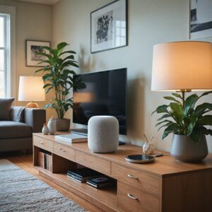
White holds a prominent place in home décor due to its versatility and powerful symbolic meanings. It is widely appreciated for its ability to bring freshness, interest, and depth to various surfaces such as weatherboards, cladding, or bricks, ranging from airy and whimsical to timeless and classic aesthetics depending on the shade selected. White is often used as a defining or framing color, especially in architectural elements like doors and windows, where brighter, cleaner whites such as Taubmans Brilliant White help to highlight the main body of color effectively.
Beyond its practical applications, white carries deep cultural and psychological significance. In many spiritual contexts, white symbolizes peace and transcendence, while in technology and branding, it represents minimalism and modernity. Historically, white has been associated with purity, power, and innovation, which contributes to its enduring popularity in design. Iconic architectural landmarks, including the Sydney Opera House, the Taj Mahal, the Lotus Temple, and the White House, exemplify white’s ability to create striking yet serene presences that elevate the aesthetic of spaces.
However, the use of white requires careful consideration of environmental factors such as natural light. Carlene Duffy emphasizes the importance of accounting for the quality of light a space receives, as direct sunlight can drastically alter the perception of white tones. The contextual awareness of a home’s style, location, and lighting conditions is essential for harnessing white’s full potential in décor. Despite its many positive associations, white can also evoke feelings of emptiness or coldness if overused, necessitating a balanced approach when incorporating it into interiors. Furthermore, cultural interpretations of white vary significantly; while it often signifies purity and simplicity in Western cultures, it is linked to death and sadness in many Eastern traditions, highlighting the importance of cultural sensitivity in design choices.
Carlene Duffy: Background and Expertise
Carlene Duffy is an accomplished interior designer and the director of Cedar + Suede Interior Design Studio, a full-service design firm based on the Gold Coast. She gained public recognition as a former contestant on the television show The Block, but has since become widely regarded as an interior style guru known for her bold use of color and distinctive design approach.
Passionate about interior design, Duffy leads her studio in creating tailored, stylish environments for residential, commercial, and hospitality clients. Her expertise extends beyond aesthetics, encompassing a keen understanding of the technical aspects of interiors, such as curtain pelmets, headings, tracks, and fabric coordination. This holistic approach ensures that every project she undertakes benefits from a refined balance of functionality and visual appeal. Duffy emphasizes the importance of texture and materiality in her designs, often incorporating elements like wooden paneling, velvet, limewash, and linen to add depth and interest to spaces. This thoughtful layering not only enhances the sensory experience of a room but also elevates its overall atmosphere. Through her leadership at Cedar + Suede, Carlene Duffy continues to influence contemporary interior design, encouraging clients and followers to embrace creativity and individuality in home décor.
Expert Principles for Using White in Home Décor
White offers a versatile and impactful choice in home décor, capable of adding freshness, interest, or depth depending on the application and shade selected. Carlene Duffy emphasizes the importance of carefully choosing white tones, especially for exteriors, where direct sunlight can drastically alter the appearance of the color. For outdoor use, whites such as Taubmans Gazebo, Pebble Bay, Aspen Snow, or Thin Ice are favored for their light-absorbing qualities, while brighter, cleaner whites like Taubmans Brilliant White are ideal for framing areas such as doors and windows to create contrast and allow the main body of color to stand out.
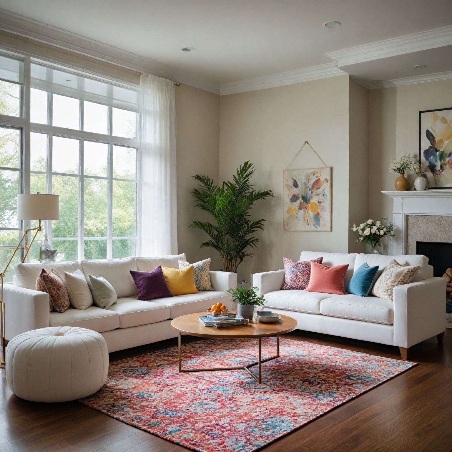
In interior settings, flat white walls and smooth white furnishings create a soothing backdrop but risk becoming monotonous if not layered thoughtfully. To avoid a sterile atmosphere, Duffy recommends incorporating various fabrics and subtle patterns along with warm shades like gold, pale tan, or faded yellow to add warmth and dimension. This layering approach breaks up the flatness of white and infuses personality into the space. Duffy also critiques minimalism in home décor, noting that while it has its place in art galleries and museums, it can hinder the warmth and individuality that make a house feel like a home. She advocates for spaces that reflect both high functionality and a considered aesthetic, allowing for personal expression beyond minimalist constraints.
Moreover, using crisp whites, soft pastels, and light neutrals can visually expand small rooms by reflecting more light and creating an airy, open feeling. Painting ceilings in lighter shades than the walls further enhances the illusion of higher ceilings and added vertical space. By applying these principles, white becomes a powerful tool in creating inviting, dynamic, and personalized home environments.
Practical Tips for Using White
When incorporating white into home decor, it is essential to consider several key factors to achieve the desired effect. Carlene advises paying close attention to the style of your home, its location, and especially the quality of natural light your space receives, as these elements can significantly influence how white paint appears on walls and ceilings. Additionally, the dominant colors in the room, particularly flooring, should be taken into account because light interacts differently with various surfaces—wooden floorboards tend to reflect light, whereas darker carpets may absorb it.
Sampling white paints before committing to a full paint job is crucial, as the perception of white can vary greatly depending on light conditions and surrounding colors. For creating layered white effects, Carlene recommends using a brighter, cleaner white such as Taubmans Brilliant White, which works well for framing, doors, and windows. When applying white to exterior surfaces, extra caution is needed because direct sunlight can drastically alter the paint’s appearance. Popular exterior whites include Taubmans Gazebo, Pebble Bay, Aspen Snow, and Thin Ice, all chosen for their light-absorbing qualities and versatility in adding freshness or depth to materials like weatherboards and bricks.
To maintain harmony in a space, it is important to reflect the undertones of white throughout the color scheme. Trish emphasizes matching the warmth or coolness of white with the pastel tones in a room; for example, a warm white pairs best with warm peachy-terracotta hues, while cool whites complement cooler tones. This careful coordination helps create a balanced and cohesive aesthetic.
White’s ability to visually expand a room is another practical advantage. Crisp whites, soft pastels, and light neutrals reflect more light and can make small spaces feel airy and open. Painting ceilings a lighter shade than walls can also enhance the illusion of higher ceilings and additional vertical space. However, overuse of white can sometimes lead to a stark or cold atmosphere, especially in larger rooms or those with abundant natural light, so balancing white with textures and complementary colors is recommended.
Incorporating texture is an effective way to add visual interest and warmth to white-dominated interiors. Using materials such as cable knits, velvet, suede, natural woven fibers like wicker and rattan, or reflective surfaces like mirrors and metallics can prevent spaces from feeling flat or sterile. Layering various fabrics and subtle patterns further enriches the decor, while introducing warm accents such as gold, pale tan, or faded yellow tones helps soften white’s sometimes clinical appearance.
Integration of Cultural and Symbolic Meanings in Design
Incorporating cultural and symbolic elements into home decor requires a thoughtful and respectful approach. For example, Japanese garden components such as pebbles, water features, and wooden decks, along with interior plants like bonsai and bamboo, can enrich a space while honoring their cultural origins. It is crucial to use design elements that are ethically sourced and to understand the religious and symbolic meanings behind objects before including them in a design to avoid cultural appropriation. Cultural appropriation occurs when objects or patterns with deep cultural significance are reduced to mere decorative items without acknowledgment of their meaning.
A responsible way to integrate cultural influences is to draw inspiration from patterns, colors, or styles and adapt them in ways that align with one’s personal aesthetic. For instance, using paint colors derived from cultural artwork allows for respectful homage without misusing sacred symbols. This method emphasizes cultural competency, fostering sensitivity to the historical and social contexts of design elements.
Moreover, design choices can carry broader social implications. Some communities have called attention to the presence of racially insensitive or oppressive symbols in decor, such as Confederate flags or colonial busts, highlighting the need for cultural awareness and the creation of restorative spaces that affirm marginalized identities. Incorporating cultural symbolism with understanding can thus contribute to healing and education within diverse communities.
Symbolically, colors like white play a significant role across cultures and design disciplines. White embodies purity, peace, and transcendence in spiritual contexts and conveys cleanliness and spaciousness in interior design. Iconic architectural landmarks such as the Sydney Opera House and the Taj Mahal demonstrate white’s ability to evoke elegance and serenity. However, balance is essential, as overuse of white can lead to feelings of emptiness or coldness. Understanding these layered meanings allows designers to use white and other elements with intentionality and cultural awareness.
Common Mistakes to Avoid When Using White
When incorporating white into home decor, several common pitfalls can detract from its intended effect. One frequent mistake is overusing white to the point where spaces feel empty or cold rather than fresh and inviting. While white is often employed to create visual clarity and highlight other colors, an excess can evoke a sense of sterility or emotional emptiness, making balance crucial.
Another error involves neglecting the impact of natural light on white surfaces. Direct sunlight can drastically alter the appearance of white paint, sometimes causing it to appear too bright or washed out. This is especially important when selecting whites for exteriors, where shades can shift dramatically under varying light conditions. Choosing the right shade of white and considering how light interacts with it is essential to avoid unexpected results.
Using a single shade of white uniformly across different elements can also lessen the overall effect. For example, when layering whites, employing a brighter, cleaner white for framing features such as doors and windows can help define spaces and make colors pop. Taubmans Brilliant White is often recommended for this purpose, but without thoughtful variation, white can become monotonous and flat.
Lastly, a common oversight is failing to incorporate texture within white-themed interiors. Because white surfaces reflect light strongly, spaces dominated by white can feel stark or lack depth if they rely solely on color. Integrating a mix of tactile and visual textures—such as natural woven materials like cork, wicker, or rattan, as well as soft elements like sheepskins and cowhides—adds warmth and contrast, preventing white spaces from appearing sterile or uninviting.
By avoiding these mistakes—overuse, ignoring light effects, lack of contrast in white tones, and insufficient textural variety—homeowners and designers can harness the full potential of white to create spaces that are both timeless and welcoming.
Case Studies and Examples
Interior stylist and renovation expert Carlene Duffy offers practical insights into the application of white paint in home decor, emphasizing how subtle differences between white shades become more pronounced on larger surfaces. For instance, when extending a home, matching the new white walls with the existing structure is crucial, as two whites that appear nearly identical in small swatches can contrast significantly on expansive walls.
In her work with Cedar and Suede interiors, Carlene demonstrates a layered and saturated approach to color, including the strategic use of whites, to create spaces that feel sophisticated yet deeply connected to the unique character of the building and its occupants. This method results in designs that maintain their appeal and relevance over time, showcasing how white tones can be employed to enhance design longevity while preserving a strong sense of “home”.
Carlene also advises using reflective materials such as mirrors and metallic finishes alongside darker palettes to add drama and light, which complements her approach to balancing white surfaces. This technique helps lift interiors that might otherwise feel closed in or somber, illustrating how white can work in harmony with other design elements to create dynamic and inviting environments.
In smaller rooms or spaces with limited natural light, Carlene recommends crisp whites, soft pastels, and light neutrals to visually expand the area. Painting ceilings in a lighter shade than the walls can further enhance the illusion of height and openness. However, she warns that in larger rooms with abundant natural light, white walls might feel stark or cold if not paired thoughtfully with other design components to achieve warmth and balance.
Reception and Impact
Carlene Duffy, director of Cedar + Suede Interior Design Studio and former contestant on The Block, has garnered considerable attention for her distinctive approach to home decor, particularly her expert use of white and bold color palettes. Recognized not only as a television personality but also
Publications and Media
Carlene Duffy has contributed to various media and publications that emphasize the significance of design and symbolism in contemporary contexts. Notably, Duffy’s work in poetry, such as her collection The World’s Wife, explores feminist themes through the use of symbolism and repetition devices to critique socially accepted oppressive behaviors toward women. This literary background enriches her approach to design, where symbolic meaning and transformation are key elements.
In the realm of home decor, Duffy has collaborated with major brands to extend her influence. A significant example is her partnership with Amart, alongside Michael Duffy and the TV show The Block, which aimed to solidify their presence in the furniture and home design industry. This campaign involved a collaborative approach to content creation, focusing heavily on social media platforms to showcase popular home décor and furniture pieces with engaging and aspirational content tailored for Amart’s audiences. Additionally, Duffy is associated with Cedar & Suede Interior Design Studio, further highlighting her professional engagement in the field.
Beyond her design work, Duffy is also part of broader cultural discussions. For example, she addresses issues of social perception and cultural deprivation in relation to access to art institutions, reflecting on how such experiences shape identity and cultural engagement. Her multidisciplinary presence across poetry, interior design, and cultural commentary positions her as a prominent figure blending creative expression with practical expertise in home decor.
The content is provided by Blake Sterling, Home Upgrade News