Summary
Discover Carlene Duffy’s Ultimate Home Color Advice: Must-Read Tips is a comprehensive guide to interior color design principles and practical applications curated by Carlene Duffy, an acclaimed Australian interior stylist and television personality. Best known for her roles on Channel Nine’s renovation shows The Block and Reno Rumble, Duffy has established herself as a prominent voice in contemporary interior styling through her bold, layered, and sophisticated use of color that celebrates the unique character of both homes and their occupants. Her work, showcased via her design studio Cedar and Suede and extensive social media presence, emphasizes the emotional and psychological impact of color in creating inviting, personalized living spaces.
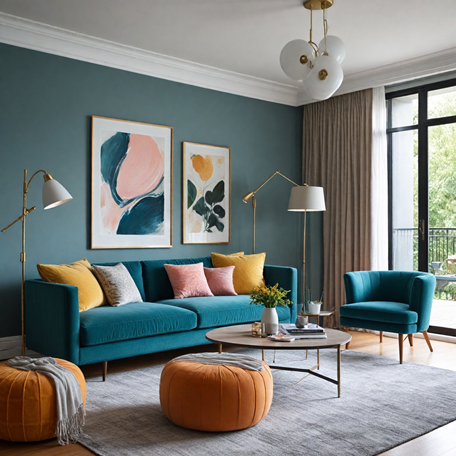
Duffy’s philosophy challenges the common trend of neutral, beige-dominated interiors by advocating for a nuanced and context-driven approach to color selection. She balances rich, saturated hues in cozier, darker areas with light-reflecting tinted whites on upper floors to maximize natural light and foster openness. Grounded in established color theory—including the use of color harmony, temperature, and tonal layering—her advice addresses both aesthetic cohesion and functional needs of diverse home environments. Through detailed tips, Duffy encourages homeowners to thoughtfully apply color not only to walls but also in furniture, textiles, and decorative accents to create harmonious and emotionally resonant spaces.
Beyond aesthetics, Duffy highlights color’s significant psychological and physiological effects, linking color choices to mood enhancement, social connection, and well-being. She promotes arrangements that foster intimate social zones over passive layouts, underscoring the role of color in shaping behavior and atmosphere within homes. Her insights draw on contemporary research on color psychology and consumer behavior, positioning her guidance at the intersection of design, wellness, and cultural trends.
Carlene Duffy’s influence extends through her high-profile renovation projects, media appearances, and educational efforts, making her a trusted authority on home color selection. Her contributions have sparked broader conversations about the role of color in interior design, emphasizing bold, personalized choices as a means to create lasting and meaningful home environments.
Background
Carlene Duffy is an interior stylist, blogger, and television personality best known for her appearances on Channel Nine’s renovation shows, including The Block and the inaugural season of Reno Rumble, where she participated alongside her builder husband, Michael. Together, they operate Cedar and Suede, a full-service interior design studio and home design blog based on the Gold Coast. The studio focuses on creating interiors that celebrate the unique qualities of both the building and its occupants, emphasizing a layered and saturated approach to color to achieve tonality, sophistication, and lasting design appeal.
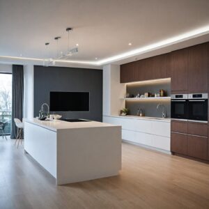
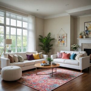
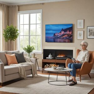
Duffy has established herself as a trusted interior style adviser who is unafraid of using color in creative and impactful ways. She encourages the use of white walls as a neutral backdrop to allow art, furniture, and textiles to bring color and personality into a space. Her design philosophy balances the use of richer colors and textiles in cozier, darker spaces, such as basements, with light-reflecting tinted whites on upper floors to maximize natural light and create an airy atmosphere. Through her work and social media presence, Duffy promotes versatile and inviting interiors that foster connection and conversation, such as arranging furniture to create intimate social zones rather than focusing solely on television viewing.
Philosophy and Approach to Home Color
Carlene Duffy’s approach to home color emphasizes a rich, layered, and saturated use of hues that celebrates both the unique qualities of a building and the personalities of its occupants. Her design philosophy champions creating spaces that are timeless, sophisticated, and filled with character through carefully crafted tonality and depth. Rather than applying color uniformly, Duffy advocates for a nuanced strategy that allows colors to evoke emotion and influence perception within interior environments, drawing on established color theories that provide a logical structure for how colors interact and resonate.
Duffy often tailors her use of color to suit the specific context of a home. For example, in character or period houses, she embraces bold, saturated tones that enhance the property’s heritage and architectural details, while also incorporating retro and vintage pieces for added style, sustainability, and budget-consciousness. In brighter spaces with ample natural light, she tends to balance the palette with lighter or neutral tones to maintain freshness and a sense of openness, such as leaving bathrooms neutral to complement their natural illumination.
Her color selections also consider psychological effects: softer shades like certain grays provide a calming and timeless atmosphere, though they have a less intense emotional impact than other colors. Darker grays, conversely, can introduce moodier, edgier feelings similar to those evoked by navy or black, while white remains a popular choice for ceilings and trim due to its ability to refresh spaces and highlight more vivid colors through contrast. This layered approach not only contributes to design longevity but also ensures each room conveys a deliberate mood and personality reflective of its inhabitants.
Key Principles of Home Color Selection
Color theory forms the foundational framework for selecting colors in home design, offering a logical structure through three main categories: the color wheel, color harmony, and the contextual use of colors within a space. Understanding these principles helps homeowners create cohesive and emotionally resonant environments.
Choosing the right color palette is essential because color significantly influences how people perceive and experience a room. A well-selected color scheme can evoke specific emotions, enhance a design style, and unify different areas of a home, often transforming the atmosphere with as little as a fresh coat of paint. The decision process should begin by considering the mood and function desired for each room—whether aiming for tranquility in a bedroom or vibrancy in a dining area—along with factors such as available space, furnishings, and lighting conditions.
Certain color combinations are more effective than others. For those uncertain about mixing colors, monochromatic schemes offer a safe and elegant choice. Using a single color in varying tones and shades can create harmony and serenity, lending a chic and cohesive style to interiors. Additionally, neutral colors like gray, when used thoughtfully, can provide a calming background that allows other colors to stand out. Different shades of gray evoke distinct emotional responses; lighter grays are timeless and hopeful, while darker tones can induce moodier or edgier feelings.
Beyond aesthetics, color also has psychological and physiological impacts. Emerging research, though often anecdotal, indicates that colors can influence moods, feelings, and even physical responses such as blood pressure and metabolism. Since color can serve as a powerful nonverbal communicator, influencing decisions and creating immediate emotional impressions, selecting colors with awareness of their psychological effects is crucial in home design.
In practice, bold use of color—such as broad application of vibrant hues—can shift from being a focal point to setting an overall mood for a room. In such cases, balancing these choices with complementary furniture and decor helps maintain harmony and avoids overwhelming the space. Ultimately, successful home color selection blends an understanding of color theory with personal preferences and the specific functional needs of each room to create inviting and well-balanced interiors.
Practical Home Color Advice and Tips
When selecting colors for home interiors, it is essential to consider both the emotional impact and the visual harmony they create within a space. Interior designers often return to tried-and-true color schemes that balance style with comfort, ranging from rich, glamorous hues to cool, coastal tones suitable for every room in the home.
Understanding color theory is fundamental in making effective color choices. Color theory explains how colors interact, the emotional responses they can evoke, and how different combinations and proportions influence a room’s mood. For instance, colors from the same temperature family—warm tones like reds, oranges, and yellows or cool tones such as grays, blues, and purples—can help create a cohesive flow throughout a space.
Gray, as a versatile neutral, offers a calming yet somewhat unemotional effect. While lighter shades of gray evoke a timeless and hopeful atmosphere, darker grays can introduce a moodier, edgier vibe similar to navy blue or black. However, gray generally has less overall impact on mood compared to other colors, which can be more stimulating or comforting depending on their hue.
Bold colors, when used extensively, may set a dominant mood in a room rather than serving as a mere focal point. To balance such boldness, incorporating furniture in neutral tones with varying textures—like woven cotton or velvet—can provide visual rest and ground the color palette effectively. Moreover, repeating a strong color accent throughout different elements, such as upholstery, mirror frames, or lampshades, can unify the design and create a harmonious connection across spaces.
Color not only influences aesthetics but also affects well-being and psychological states. For example, certain shades of red can elevate energy levels and stimulate the senses, which makes red a popular accent color in textiles and furniture rather than an overwhelming wall color in smaller rooms. More broadly, color impacts mood, physiological reactions, and behavior, underlining the importance of thoughtful color selection in home environments.
Finally, drawing inspiration from the external environment—whether rural or urban landscapes—can help bring a natural and seamless connection between indoor and outdoor spaces. Using neutrals inspired by nature is a common strategy to achieve this effect and personalize the home decor while maintaining balance and harmony.
By applying these principles—leveraging color temperature, balancing bold hues with neutrals, and considering the psychological effects—homeowners can create inviting, stylish, and well-balanced interiors that positively influence their daily lives.
Application Techniques and Methods
Carlene Duffy emphasizes the importance of selecting appropriate color schemes and application techniques to enhance the aesthetic and spatial qualities of a home. One key approach she advocates is creating a cohesive color scheme by either choosing a color family—often represented by the vertical gradation on paint manufacturer cards—or selecting colors of similar weight, meaning different hues with comparable intensity and strength. This method ensures harmony and balance throughout interior spaces.
When it comes to white paint, Duffy highlights its nuanced application, stressing that understanding the subtle differences among white shades is crucial for achieving the desired ambiance. She advises that whites can dramatically influence light reflection and spatial perception, making small spaces appear larger and airier when applied correctly. Her guidance helps homeowners and designers navigate the complexities of white paint in renovation projects and interior styling.
Additionally, Duffy encourages the integration of color theory principles to create logical and visually appealing color structures within rooms. This can involve layering color through various elements such as wall paint, furnishings, and accessories, ensuring a harmonious overall design.
Moreover, collaborating with professional designers can enhance the customization of interior elements like window treatments. Designers assist in selecting blinds, drapes, or shades alongside complementary fabrics, finishes, patterns, and textiles to achieve a tailored and cohesive look that aligns with the chosen color scheme. This personalized approach ensures that decorative touches contribute effectively to the home’s color harmony.
Color Schemes and Combinations
Color schemes and combinations play a crucial role in interior design, significantly influencing the perception, mood, and functionality of a space. Understanding and applying color theory can help create harmonious and visually appealing environments. There are three fundamental categories of color theory: the color wheel, color harmony, and the contextual use of colors, all of which provide a logical framework for selecting effective color combinations.
Monochromatic color schemes, which use a single color with varying tones and shades, offer a simple yet elegant solution for those unsure about mixing colors. Light monochromatic palettes, in particular, create a sense of harmony and serenity while making small spaces appear larger and airier. This approach can add a chic style to room design and décor without overwhelming the senses.
Choosing colors based on temperature also affects the room’s atmosphere. Warmer tones such as reds, oranges, yellows, and browns tend to generate an energetic and inviting environment, suitable for lively areas of the home. Conversely, cooler colors like gray, blue, purple, and green evoke calmness and relaxation, making them ideal for rest spaces. Selecting colors within the same temperature family helps achieve a smoother flow and better cohesion throughout the room.
Certain color combinations can evoke specific styles or vibes. For example, pairing hunter green with rich reds creates a vintage or old-world collegiate look, which can be particularly effective in boys’ rooms when combined with complementary accessories. Such combinations demonstrate how color choices can personalize and enhance thematic room designs.
Beyond aesthetics, color is a powerful communication tool that influences emotions and even physiological responses. It can signal action, affect mood, and induce changes such as increased blood pressure or metabolism. This impact on human behavior underscores the importance of thoughtful color selection in home interiors.
Impact of Color on Interior Atmosphere and Home Value
Color plays a crucial role in shaping the interior atmosphere of a home, significantly influencing how spaces are perceived and experienced. The choice of a whole-house color palette can breathe life into a room by evoking emotions, enhancing a particular style, and creating cohesion throughout the living environment. Properly selected colors not only personalize room decor but also help harmonize the overall interior, making spaces appear more balanced and visually appealing.
The psychological effects of color on mood and behavior are increasingly recognized, with color theory—also known as chromotherapy or color healing—suggesting that specific hues and their frequencies can impact mental well-being and feelings. For example, certain colors might evoke calmness, energy, or happiness, thus influencing daily experiences within the home. While further research is needed to fully understand these effects, thoughtful color selection can contribute positively to mental health and overall well-being.
Moreover, color serves as a powerful nonverbal communication tool that can influence decisions and perceptions. Approximately 90% of snap judgments are affected by the psychological effects of color alone, highlighting the importance of understanding color meanings and their responses. Colors can signal action, influence moods, and even trigger physiological reactions, all of which affect how occupants and visitors experience a space.
When applying color to interior design, it is important to balance cohesion across rooms with the functional needs of each individual space. A color that complements the entire home might not be suitable for a particular room’s purpose or ambiance, making it essential to consider context alongside harmony. Additionally, using lighter colors can visually expand smaller rooms, making them appear larger and more open.
Notable Projects and Case Studies
Carlene Duffy, through her interior design studio Cedar and Suede based on the Gold Coast, has developed a reputation for creating interiors that are dynamic, personalized, and ever-evolving. Her projects are recognized for their careful curation of collected pieces that truly reflect the personalities of the inhabitants, resulting in spaces that feel lived-in and authentic.
Her design philosophy emphasizes a rich, layered approach to color, aiming to craft environments that are timeless, sophisticated, and brimming with character. This approach can be seen in her projects where color schemes are thoughtfully selected to evoke specific emotions and create distinct moods, drawing from established principles of color theory. For instance, a recurring technique in her work involves the strategic repetition of a strong, signature color in various elements throughout a home—such as upholstery, mirrors, and lampshades—to unify the space and make a bold statement.
Duffy’s influence extends beyond her studio projects to her television appearances, including notable renovation shows like Channel Nine’s The Block and Reno Rumble, where she brings her design expertise to a wider audience. These platforms have showcased her ability to balance functionality with aesthetic appeal, often incorporating tried-and-true color pairings that she revisits across different rooms to maintain cohesiveness and style. Through both her hands-on projects and media presence, Carlene Duffy has established herself as a key figure in contemporary Australian interior design.
Reception and Influence
Carlene Duffy, director of Cedar and Suede Interior Design Studio, has garnered attention for her distinctive approach to color in interior design, emphasizing a layered and saturated use of hues to create tonality, sophistication, and lasting appeal in living spaces. Her philosophy challenges the prevailing trend toward neutral, “same-samey” home interiors, encouraging homeowners and renovators to move beyond the ubiquitous beige palette and embrace bolder color choices.
Her design ideas have resonated with a broad audience, including her social media followers, who appreciate her fearless use of color and the
Related Works and Publications
Carlene Duffy’s approach to interior styling is informed by a strong foundation in color theory, which she encourages students and enthusiasts to explore through key texts. For instance, she references the color theory chapter in The Book as essential reading for understanding the basics of color use in design. Additionally, Duffy recommends Josef Albers’ Interaction of Color as a deeper resource to grasp the complexities and nuances of color interaction and perception.
Beyond theoretical works, Carlene and her husband Michael Duffy share their practical experience through their design and construction business, Cedar and Suede, as well as their home design blog. Their recent major project—a decade-long family home renovation—was featured on the television show Ready Set Reno, where they also shared valuable renovation tips derived from their extensive hands-on work. Carlene’s expertise is further recognized through her television appearances on popular renovation programs such as Channel Nine’s The Block and Reno Rumble, enhancing her profile as a trusted interior style guru.
The content is provided by Sierra Knightley, Home Upgrade News